New York Times Cover: Connection in NYC
2026
Photography, paint pen
9.5 × 11.5 inches
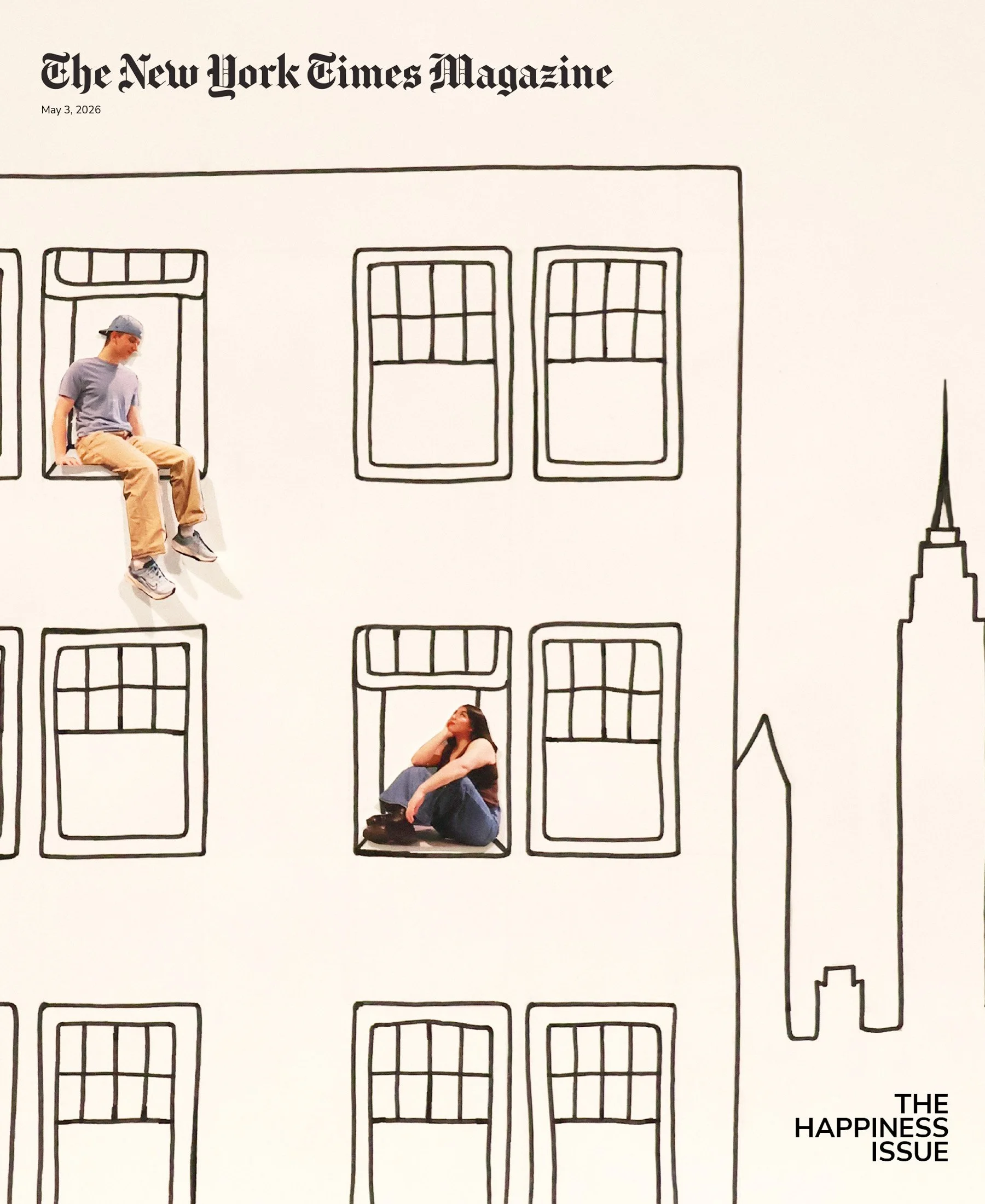
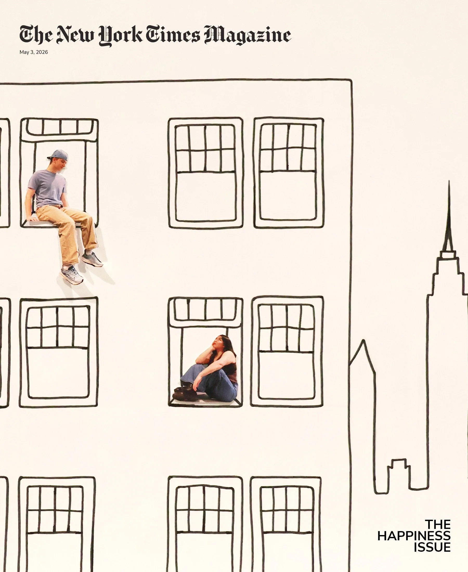
This design is for the cover of a special issue of The New York Times Magazine entitled “The Happiness Issue”. This cover was inspired by Susan Dominus’ article with the subtitle which reads, “Decades of wellness studies have identified a formula for happiness, but you won’t figure it out alone.” The article makes the point that human connection is what causes happiness.
I chose to represent this idea by illustrating two people living on different floors of a NYC high rise, gazing at each other across the distance. With this cover, I wanted to depict New Yorkers who had the potential to create a connection and therefor achieve happiness. The skyline behind shows the outline of the Empire State Building to tell the reader that the illustration is in New York.
I created this drawing by photographing my models in sitting positions, which I then printed, cut out and placed onto my drawn backdrop. The simple line work of the building and sky line make the detailed and colorful cut outs visually stand out. I added the title of the issue in the bottom right corner to create visual balance with the figure focal points being in the middle and top left.
Version 1
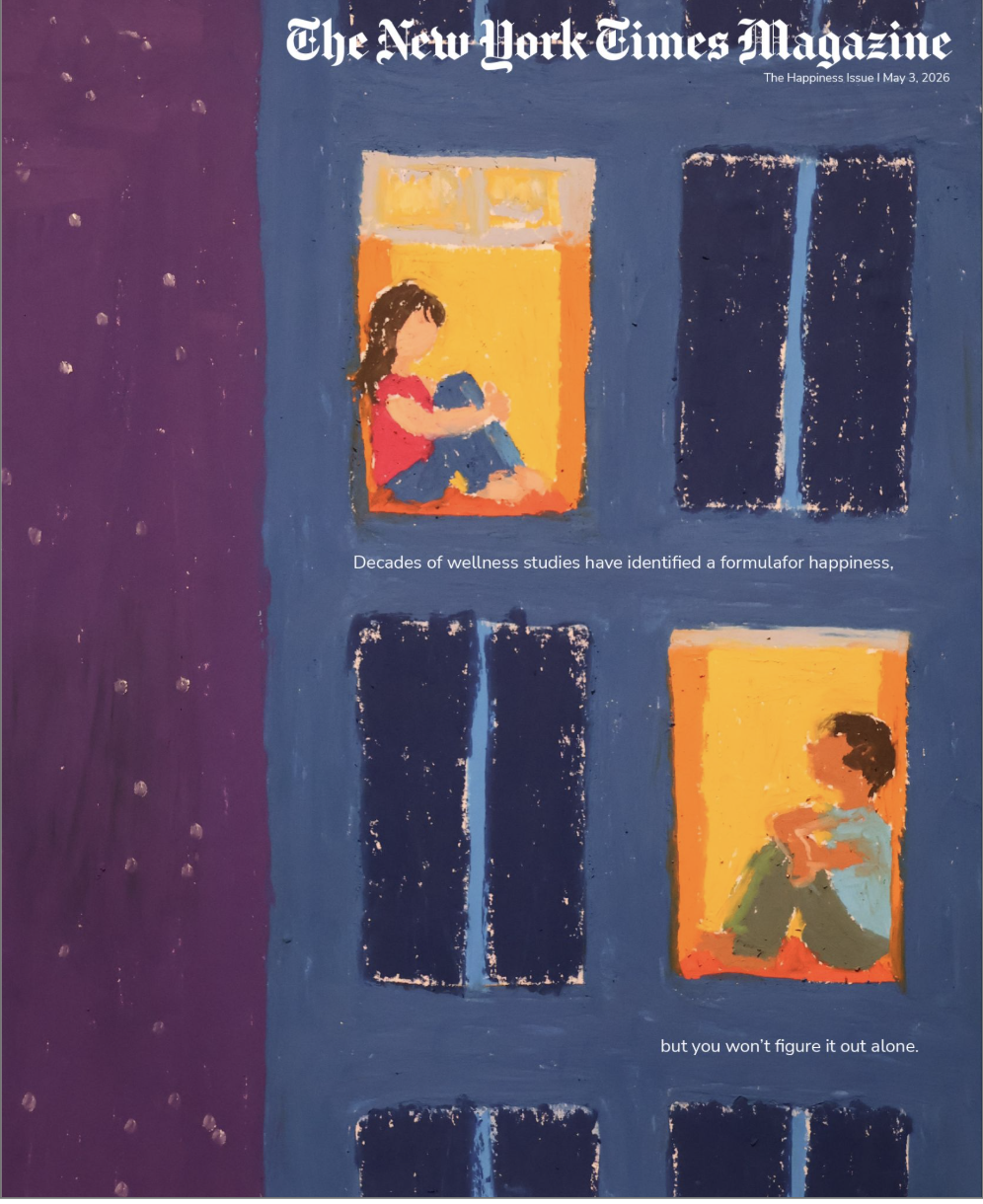
In my drawn cover, I placed the building off center, taking up 2/3rds of the frame. I struggled to understand how I could make a good composition while keeping it asymmetrical, as buildings are very rigid, evenly spaced structures. With this cover, I enjoyed playing with bright colors, especially in the lit window frames. I hoped that the ambiguity of the models (as they are not clearly recognizable, specific people) would make the concept of finding connection in your apartment building feel universal (at least to NYC residents).
Critique:
People liked the concept
Style feels too kidsy
Version 2.1
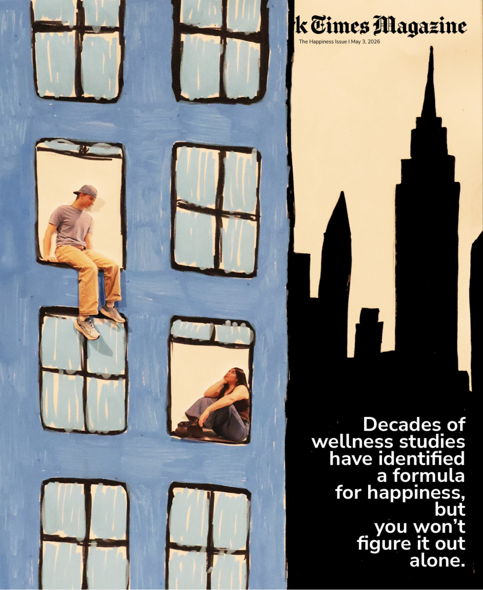
This cover was my first attempt at redoing the high rise connection idea. To make it feel more NYC, I included a backdrop with the Empire State building. I also tried to make the cover feel less kids book cover by using real models in the windows. I did this by having my friends pose, and then I printed them out and placed them onto my drawn backdrop.
Critique:
The coloring still evokes a kids book
“The Happiness Issue” text is hard to read
The rag of the subtitle could be better
Version 2.2
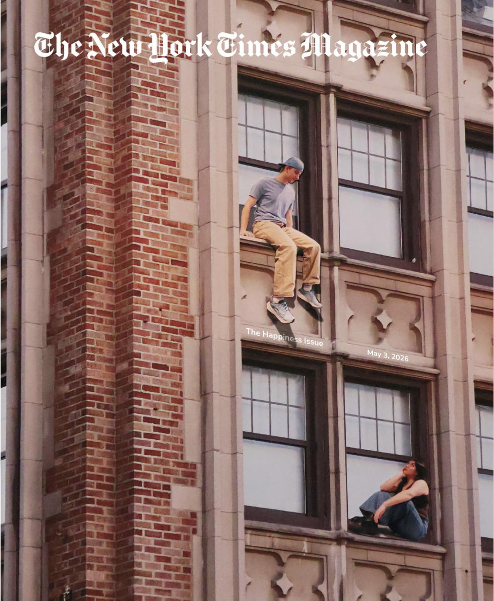
This cover was my second attempt at the high rise connection concept. I felt that a collage of real photos could help me solve the “too kidsy” problem. I took a picture of a building in the Udistrict, and researched (and asked my mother who lived in NYC) which building felt the most New York City. I then had my friends model to look like they were in the windows, looking at each other. I struggled with where to put the text in this photo, as it was quite busy.
Critique:
The building does not necessarily look like it’s in NYC
The composition and text placement could be more dynamic
Version 3: Final Cover
Final Adjustments:
I was told that my draw version was a bit messy and distracting, and that my photo version was too busy. With this in mind, I decided simple line work would be best, especially so that the models could be the focus of visual interest. I think the final version has a cleaner, simpler look, but still conveys what I wanted to show originally: the possibility of connection in NYC.