New York Times Cover: Teen Joy
2026
Photography
9.5 × 11.5 inches
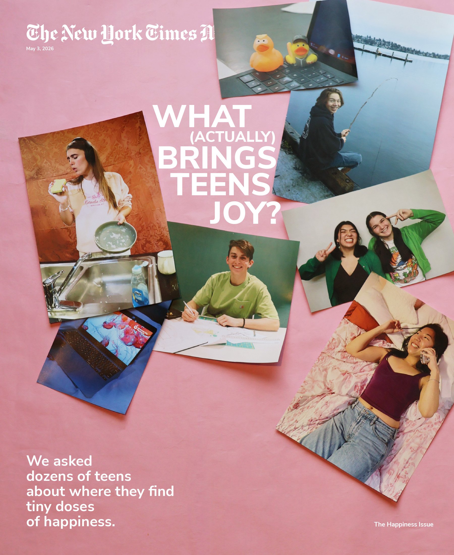
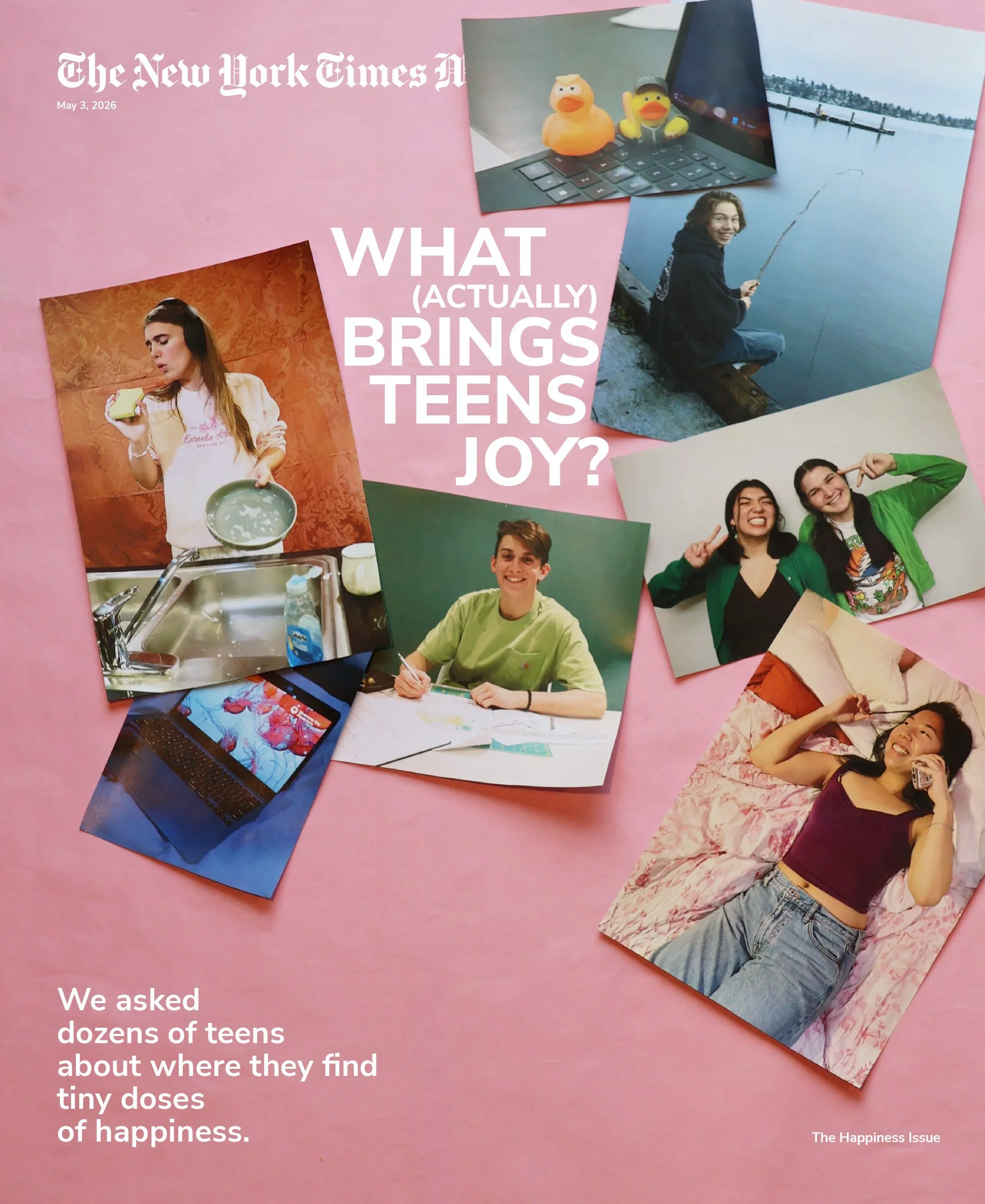
This design is for the cover of a special issue of The New York Times Magazine entitled “The Happiness Issue”. I used the actual articles in the issue to determine the subject, and I took inspiration from Charley Locke’s article titled “What (Actually) Brings Teens Joy?” She writes her findings from interviews of teens around the country.
My photo layout references many of the ways teens find joy in the article, such as talking aloud to rubber ducks, listening to gospel music while doing the dishes, matching clothes with friends, going fishing, drawing maps and watching jellyfish videos. I chose to present the images as a collection of physical prints on a pink background to mimic the way teens collect pictures of their friends and favorite memories. Physically layering the prints helped me capture the shadows and curls of paper, which added movement and depth to the composition. Pink felt like a joyful and youthful color. I cropped the image so that the photos on the right would be slightly cut off, therefor activating the edge.
I chose to put the NYTM logo at the top left of the page, as the reader’s eye usually starts there. The rubber duck image blocks the end of the logo, and trusts that the reader knows the title of the publication. I put the title at the center of the images in large print to highlight it the most. In a medium size text, I added the subtitle of the article to help the reader understand the subject of the magazine. Lastly, I added “The Happiness Issue” in small text. The placement and hierarchy of text size leads the reader in a triangle, from largest to smallest.
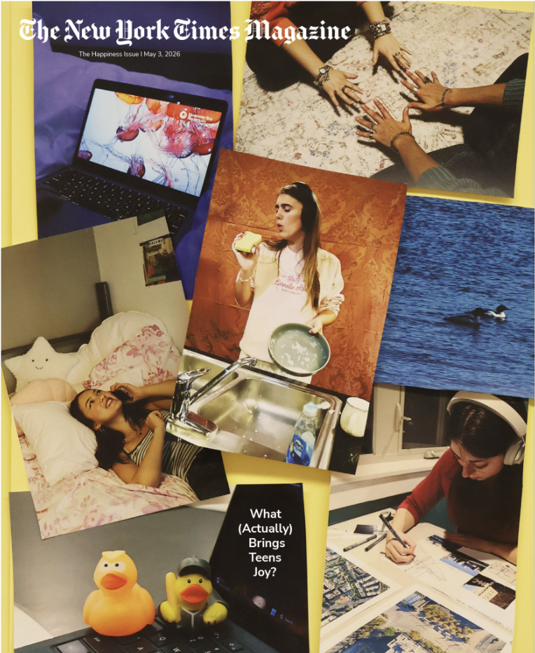
Version 1
I shot many individual pictures of the various teen activities that keep them happy. I tried creating a variety of frames and subjects (such as having 3 portraits, 2 still lives, an open-water photo and a photo of just hands). I thought variety would create visual interest. I also thought it was important to pose and edit my photos to have bright, teen-feeling colors. The brighter the colors, the happier it would feel!
Critique:
Focal point is in the center, while the eye should bounce around the image
Images are all same size, I could try making them different and leave more negative space!
Make the style of photographs more alike…make them all look posed
Try using a wider variety of models to better represent all teens
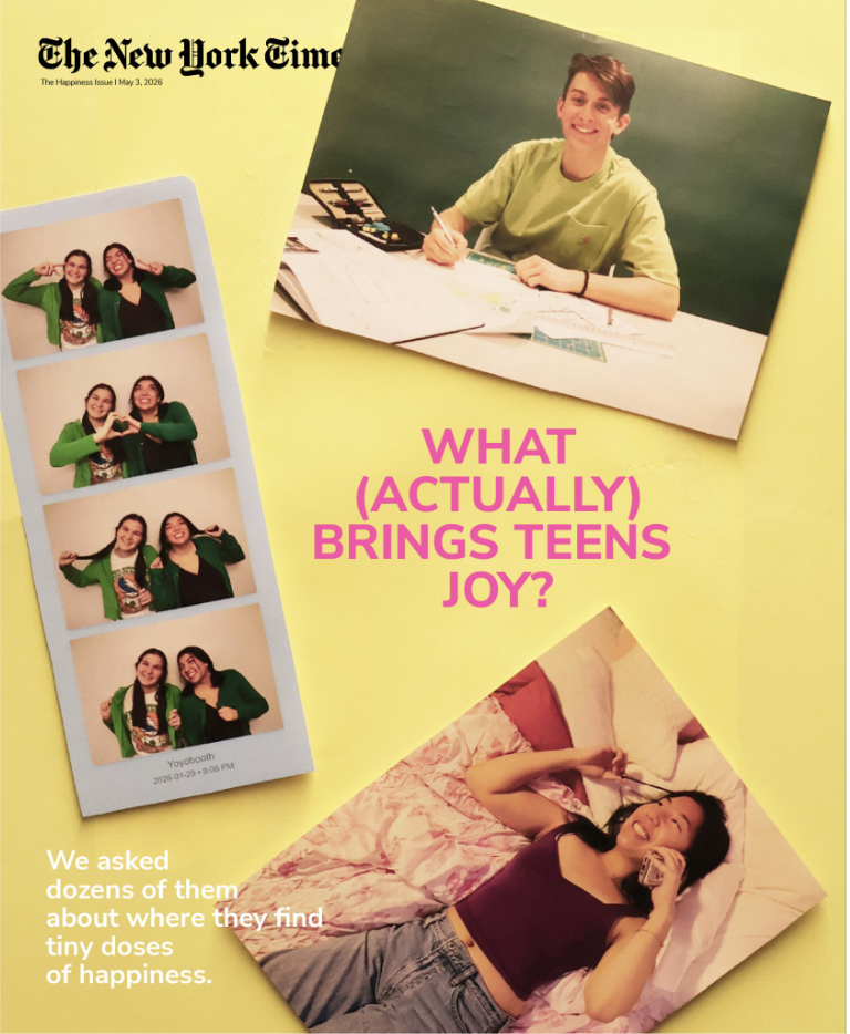
Version 2.1
This cover was my attempt to bring negative space to my Teen activities collage concept. I chose three images (one being a photo booth strip that I made myself) that had similar colors but different compositions and shapes. I placed them in a triangle, with the text slightly off center between them. I enjoyed the bright colors and the emphasis placed on pink, yellow, and green in this cover.
Critique:
The pink text is distracting, and rag could be more successful
Good rag for the bottom text, but slightly difficult to read
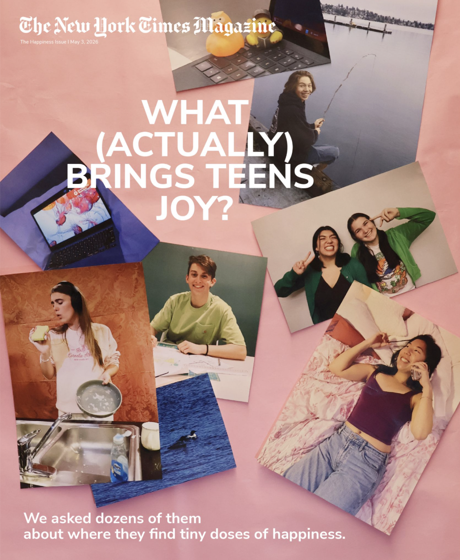
Version 2.2
This cover was my attempt to bring negative space to my Teen activities collage concept. I chose three images (one being a photo booth strip that I made myself) that had similar colors but different compositions and shapes. I placed them in a triangle, with the text slightly off center between them. I enjoyed the bright colors and the emphasis placed on pink, yellow, and green in this cover.
Critique:
The text felt messy (the rag on the center text was not good)
The bottom text had a better rag on my yellow version of the Teen joy collage
Too many photos
More negative space would be good
Version 3: Final Cover
Final Adjustments:
For the final cover, I needed to fix the rag on the center title text, and use the rag for the subtitle that I had used in version 2.1. I wanted to add more negative space as well. With this feedback, I changed the center text to fit into the space between the photos, and I also changed the bottom text to have a better rag. Overall, I think the text placement and photo placement makes the final cover look more professional, and fun!